Food photography and food product photography are not the same thing. A shot of a steaming bowl of pasta in a warm restaurant works beautifully on Instagram. Put that same image on a product listing for a packaged pasta brand, and it does almost nothing for conversion — because a buyer trying to decide whether to add something to their cart needs different visual information than someone browsing a food blog.
Online food businesses — packaged goods, D2C snacks, health supplements, beverages, spice blends — sit in a specific visual category that most generalist photographers underestimate. Here’s what actually matters for ecommerce product photography in the food space.
Freshness Signals Are Everything
The brain makes a freshness judgement within about 200 milliseconds of seeing a food image. That’s not enough time to read a label or register a brand name. It’s only enough time to feel something, and what you want a potential buyer to feel is: this looks good, I want it.
Freshness signals vary by product type. For packaged goods, it’s the condition of the packaging — no creases, no dust, crisp print reproduction, clean seal lines. For fresh or frozen products, it’s accurate colour rendering — strawberries that look actually red, not over-saturated to the point of looking artificial, and not undersaturated to the point of looking dull. For beverages, it’s condensation, fill level, and clarity.
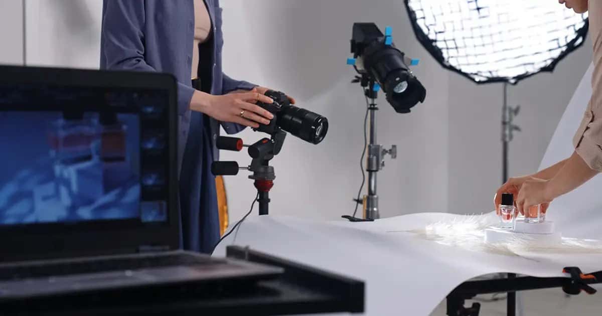
Most ecommerce product photography services that specialise in food invest significantly in pre-shoot preparation: cleaning and conditioning packaging, selecting the best specimens from a batch for hero shots, and testing multiple lighting angles before the main shoot begins. This prep phase is invisible in the final image, which is exactly the point.
The Packaging Shot vs. the Content Shot
Online food businesses need two distinct image types in their ecommerce catalogue, and treating them as one shoot brief often produces images that do neither job properly.
The packaging shot exists to communicate brand and product identity. The label needs to be readable — which means the light angle can’t create glare across text, and the crop needs to show the full front face of the pack without awkward edge cuts. For jar and bottle products, this means precise camera placement and a label that’s been aligned before shooting, not straightened in post.
The content shot exists to show what’s actually inside — the texture of a granola mix, the colour depth of a curry paste, the pour consistency of a cold-pressed juice. These images often perform better on marketplace listings than the packaging shots alone, because they answer the question a buyer can’t get from the label: what does this actually look like?
Natural Light vs. Studio Light for Food
Natural light is popular in food styling content because it feels warm and organic. For ecommerce product photography, it creates more problems than it solves.
Natural light changes. Cloud cover, time of day, season — all of it shifts the colour temperature and direction of the light between frames. For a brand shooting 25 SKUs that need to look consistent across a catalogue page, inconsistency in lighting is a real problem. A turmeric latte mix photographed at 10am in February looks different from the same product shot at 2pm in June, even with identical camera settings.
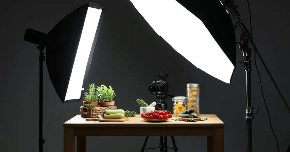
Controlled studio lighting — whether softboxes, LED panels, or purpose-built shooting tents — gives you repeatability. The same light setup produces the same result on a reshoot six months later when you launch a new flavour. That consistency is what builds catalogue coherence, and catalogue coherence is what builds brand perception.
Backgrounds and Surfaces: Less Decision Than You Think
There’s a tendency among food brands to overthink surfaces and backgrounds. Marble slabs, reclaimed wood, linen fabric, slate tiles — the styling options are genuinely endless. Most of it doesn’t move the needle on ecommerce conversion as much as people expect.
What actually matters is contrast. The product needs to visually separate from whatever it’s sitting on. A white jar on a white surface disappears. A dark glass bottle on a dark wooden board creates ambiguity. Light products benefit from mid-tone or warm surfaces; dark products photograph more clearly against light or neutral backgrounds.
For primary listing images on most Indian and international marketplaces, the background needs to be white or near-white anyway. Save the styled surface shots for secondary images, social content, and website hero sections — where mood plays a genuine role.
The Size Reference Problem
How much does this jar hold? How big is this bag? Is this portion size realistic?
These are the questions buyers ask that a beautiful, tightly cropped pack shot doesn’t answer. Including a size reference image — the product next to a hand, a common household item, or a measurement prop — is one of the most consistently underused tools in food ecommerce product photography. It reduces purchase uncertainty. Fewer surprises on delivery means fewer returns and better reviews.
Conclusion
Food product photography for ecommerce rewards preparation, technical consistency, and an understanding of how buyers actually make purchase decisions. Getting those elements right isn’t complicated, but it does require working with a photographer who understands ecommerce product photography specifically — not just food as a visual subject.
If you’re planning a shoot for a food brand or packaged product range, we’re happy to walk through what a proper brief looks like and what it produces. Reach out before you book anything.